
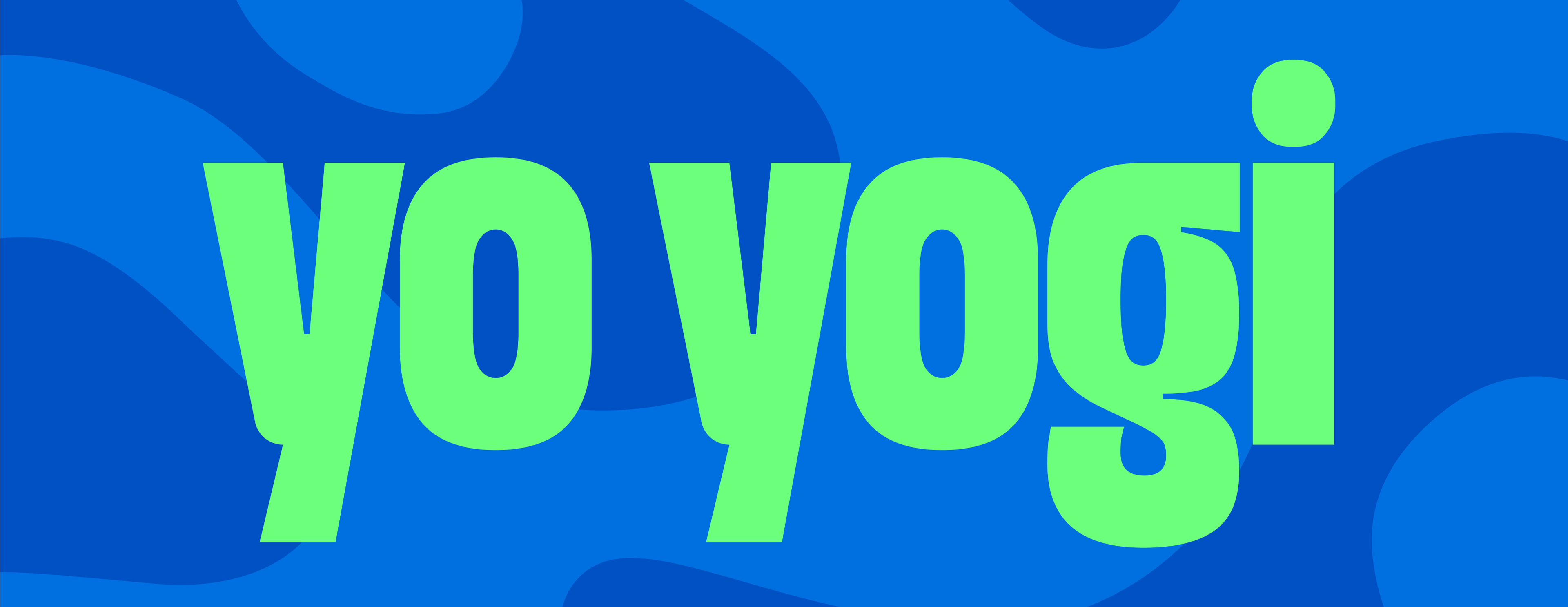
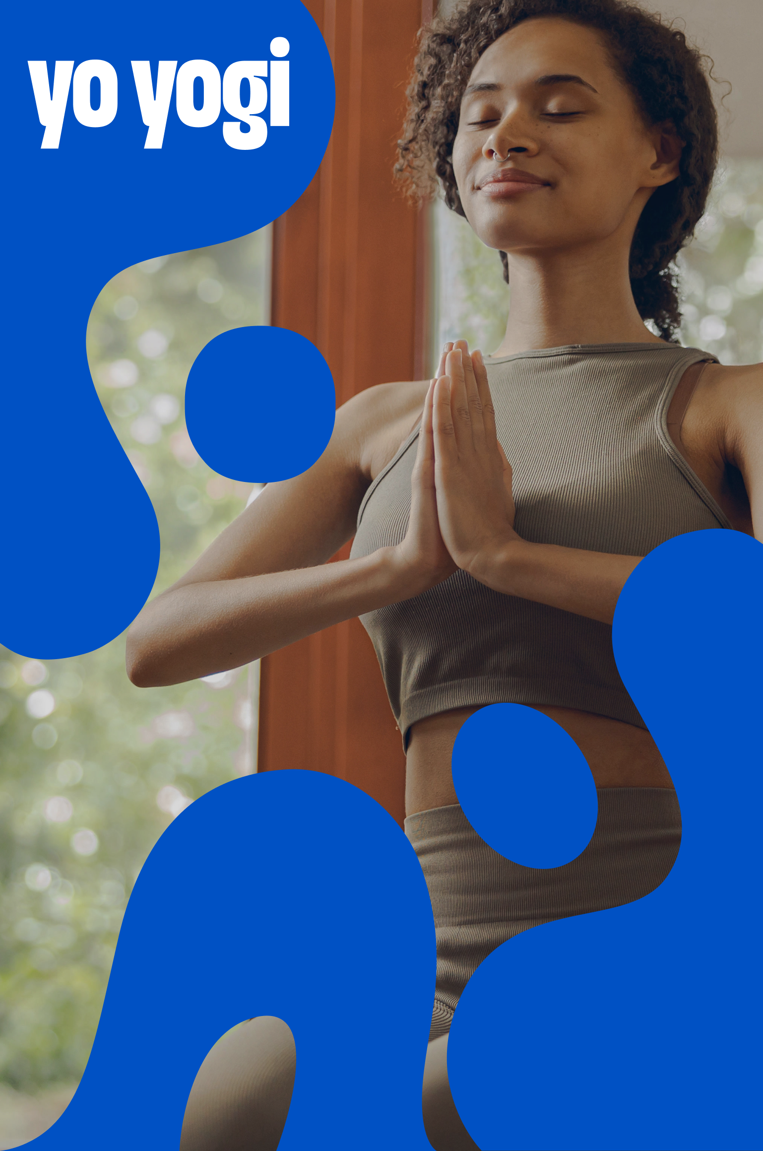
YO YOGI
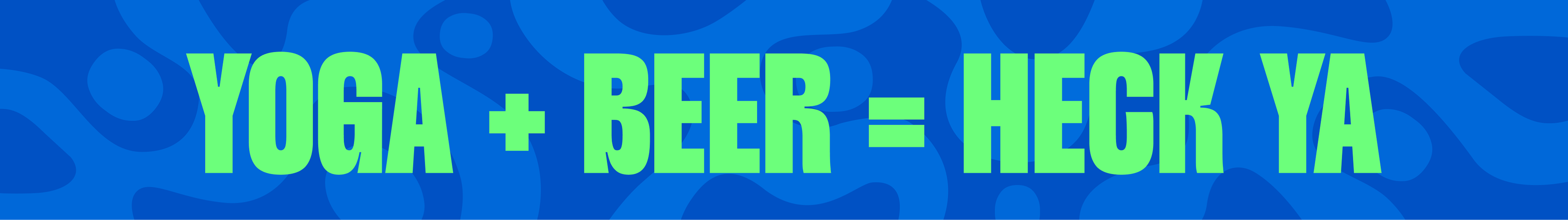
Drink beer, do yoga and support your community!
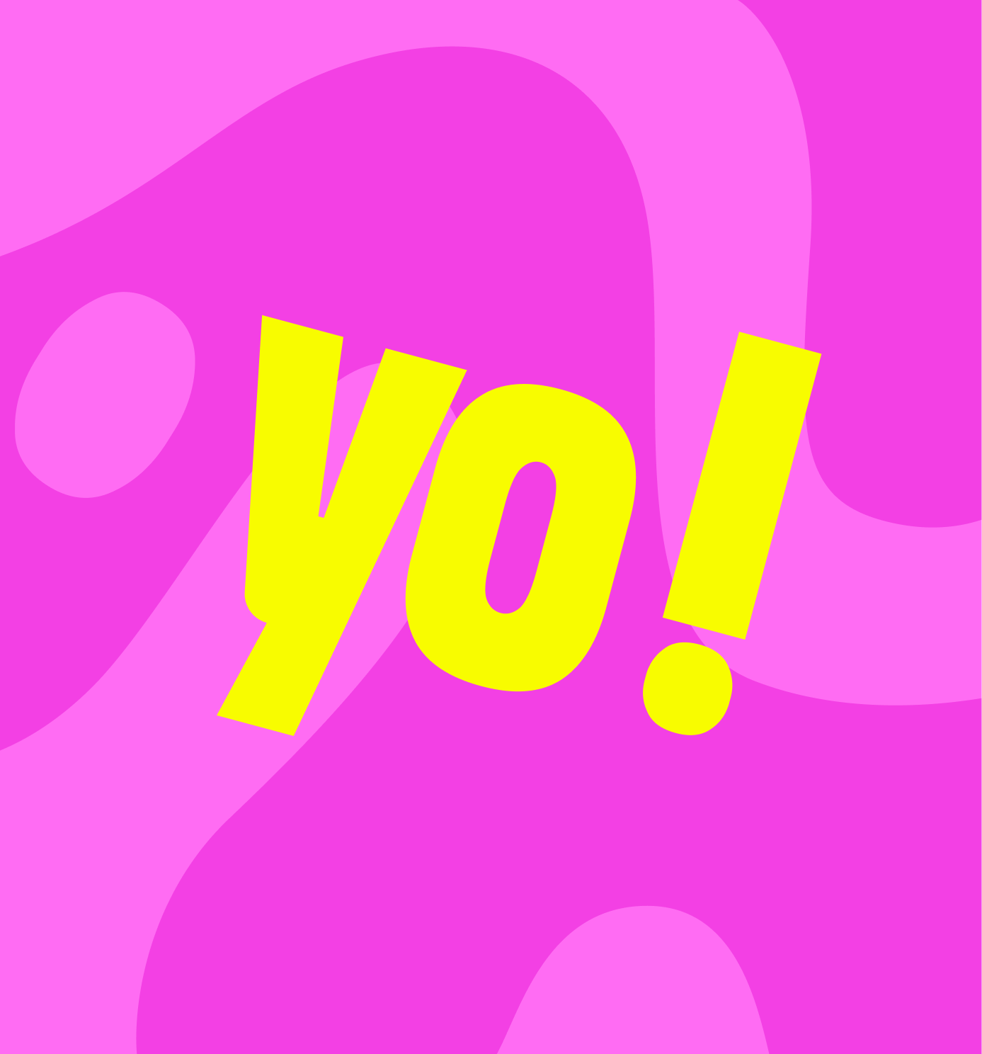
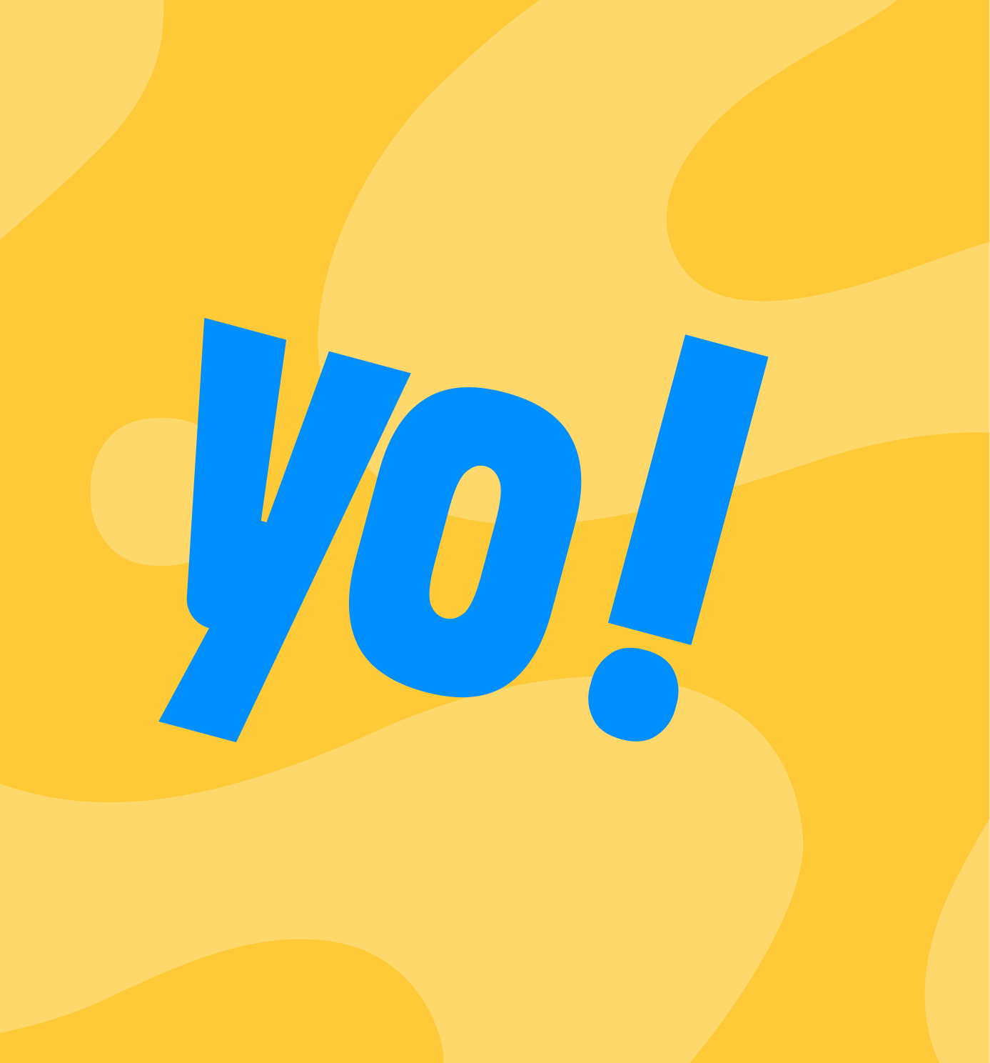
Our goal was to build a brand that feels approachable and fun, brought to life through a playful and engaging tone.
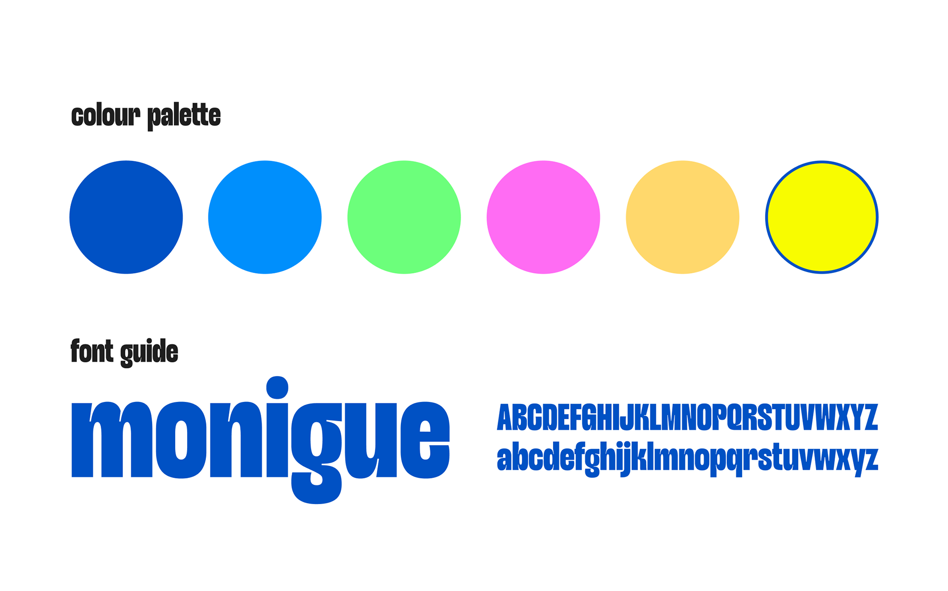
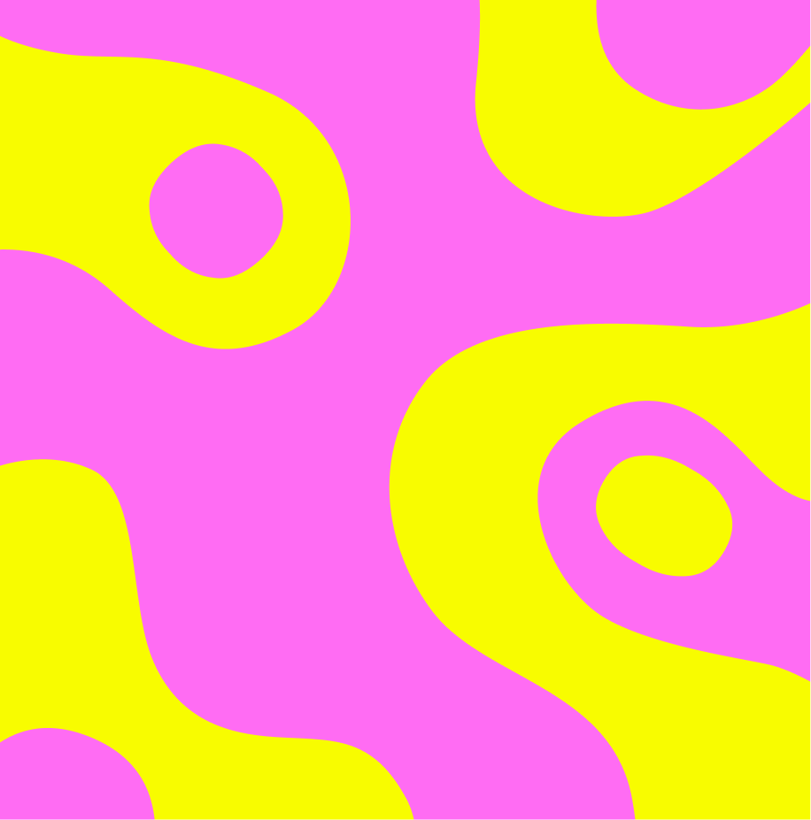
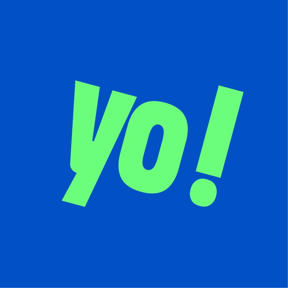
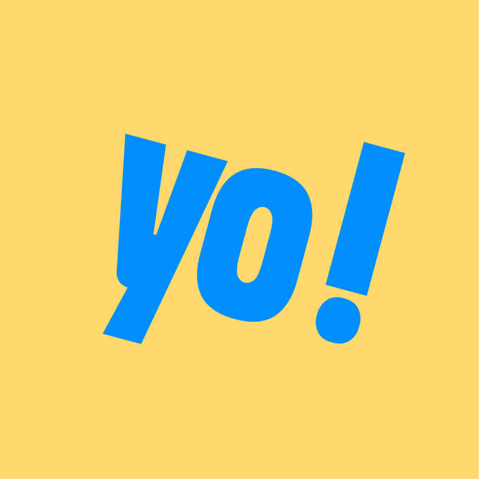
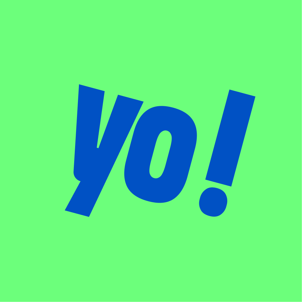
This is complemented by a vibrant colour palette that energizes the brand and reinforces its sense of joy and accessibility.
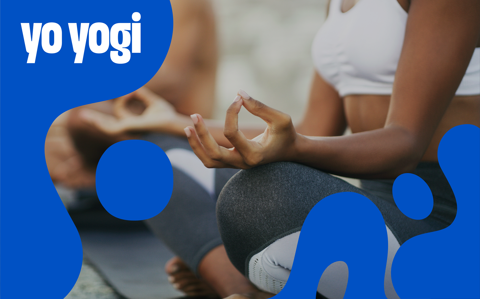
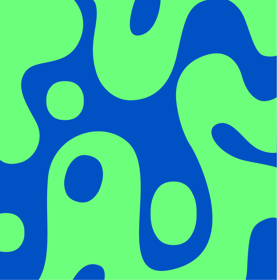
The visual elements draw inspiration from the movement of people’s forms and bodies, capturing fluidity, rhythm and expression. These dynamic shapes work in harmony with photography, creating a natural connection between graphic elements and human moments.
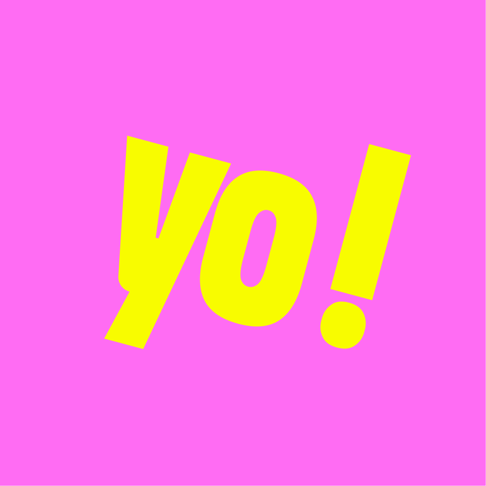
This is complemented by a vibrant colour palette that energizes the brand and reinforces its sense of joy and accessibility.
The visual elements draw inspiration from the movement of people’s forms and bodies, capturing fluidity, rhythm and expression. These dynamic shapes work in harmony with photography, creating a natural connection between graphic elements and human moments.


Brand Designer: Nia Luethe
Client: YoYogi - Sarah Elstone
Client: YoYogi - Sarah Elstone